Say Hello to Our New Look
The New and Improved Blackwing Logo
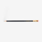
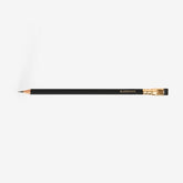
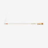
Today, we’re stoked to introduce an updated Blackwing logo for the first time since we revived the brand in 2010. The design ditches the old logo’s oblique letters for an upright look inspired by the first imprint to grace a Blackwing pencil. Although we’re moving forward, our new look is more about being present where you are.

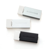
The updated logo and the “B” emblem introduced with last year’s blueprint apparel capsule were designed to be clean and modern and give us flexibility for future projects. You’ll see it applied to all of our pencils, starting today.
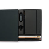
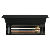
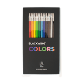
The adaptability of this updated look is on full display in our new pencil packaging. These new two part boxes stand upright, so you can use them as a pencil cup on your desk or work station. They’ll also take up less space on a shelf, whether you’re a collector or a retailer.

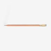
To clear up confusion and give our pencils a more consistent look, we’ve also given a name to the “Blackwing” (the black one, MMX, 601, etc). The Blackwing Matte joins the Blackwing Pearl and Blackwing Natural as our trio of modern interpretations of the timeless Blackwing 602.

You’ll also noticed we’ve decided to drop the “Palomino” name from all Blackwing pencils, starting today. Palomino will always be the pencil that inspired the revival of the Blackwing, and it will continue to be available on our sister site Pencils.com. And those of you who still want to get your hands on the old “Palomino Blackwing” imprinted pencils, the remaining stock is still available on Blackwing602.com.
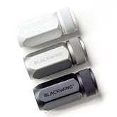
This year marks the tenth anniversary of the revival of the Blackwing, and this update is just one of the many exciting things we have planned. If you missed our new sharpener announcement, you can check it out here. Stay tuned for more exciting news in the coming months.
